Varicose Veins Cream
المعرف:
fa1fc52ec021
— الحالة:
done
— الخطوة: complete
↺ توليد جديد
تنزيل الصورة الأصلية
copy.json
brief.json
الأقسام (8)
1. hero
done
الإعدادات
تعديل الوصف (اختياري):
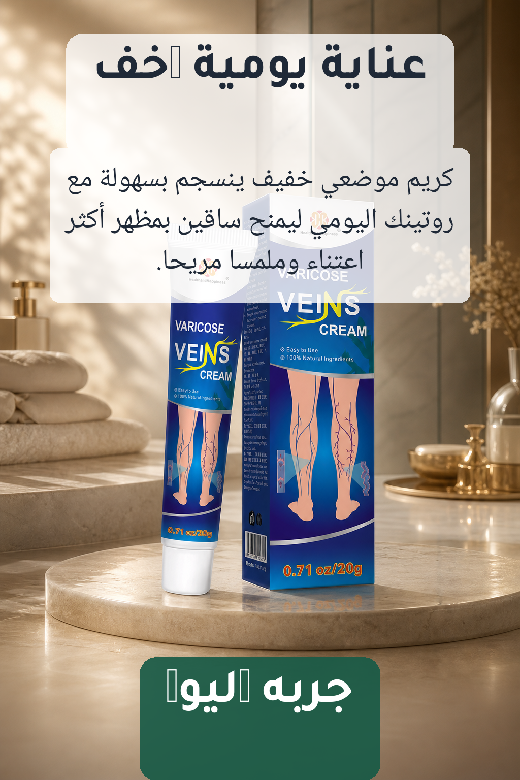
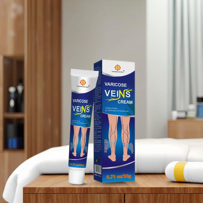
You are creating section 1 of 8 of a VERTICAL portrait landing-page banner for Varicose Veins Cream. Subject (must appear, photoreal, visually integrated into the scene): - Varicose Veins Cream (skincare / varicose veins cream) - The product packaging in reference image #1 is the EXACT subject — keep its label, colors, shape, and proportions faithful. Visual identity: - Palette: #253A87, #0A6F9A, #F6F4F0, #D6A58A, #7A5A3A, #E6B31D. - Mood: clinical, medical, clean, blue packaging, modern, informative, product mockup, surgical, minimal, commercial. - Editorial GCC (Khaleeji) aesthetic. Warm, premium, modern. - NO embedded text, NO logos other than the product's own, NO watermarks. - NO flat solid-color backgrounds — always rich texture, depth, gradients. Composition: 1024×1536 portrait, 2:3 ratio. Strongest brand impression of the whole page. SEAMLESS TOP EDGE: This is section 1 — the top of the image sets the visual tone for the entire page. Make the top edge a clean, branded gradient/texture that the next section can pick up. SEAMLESS BOTTOM EDGE: Leave the BOTTOM ~20% of the image as a calm gradient or texture (no prominent subject, no text region), so the next section's top edge can blend in cleanly. Save the bottom 256 px for the seam — keep it visually quiet. SECTION 1 — HERO ================ Role: Establish the product as the desirable hero. This is the strongest brand impression of the whole page. Scene: - The product (ref #1) placed center-frame as a clear, photorealistic hero subject, slightly larger-than-life. - Dramatic editorial lighting with a soft halo / glow behind the product. - Background: an aspirational environment that matches the category (skincare) — think premium spa-like, soft fabrics, glass, polished stone, or warm minimal interior, never literal supermarket shelves. - Empty negative space at the TOP-LEFT region for the headline overlay. - Empty negative space at the BOTTOM for the CTA overlay. Copy overlay zones (DO NOT draw text — just keep these regions visually calm): - Top: headline "عناية يومية أخف" - Below top: subhead "كريم موضعي خفيف ينسجم بسهولة مع روتينك اليومي ليمنح ساقين بمظهر أكثر اعتناءً وملمسًا مريحًا." - Bottom strip: CTA "جرّبه اليوم" Mood cue: "عناية يومية أخف — كريم موضعي خفيف ينسجم بسهولة مع روتينك اليومي ليمنح ساقين بمظهر أكثر اعتناءً وملمسًا مريحًا."
إعادة توليد
2. features
done
الإعدادات
تعديل الوصف (اختياري):
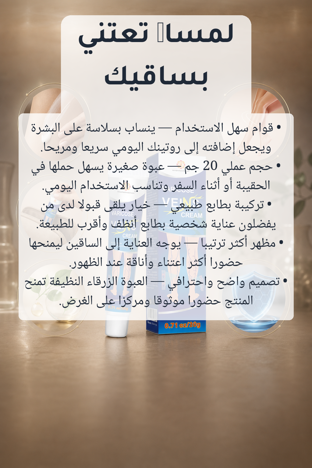
You are creating section 2 of 8 of a VERTICAL portrait landing-page banner for Varicose Veins Cream. Subject (must appear, photoreal, visually integrated into the scene): - Varicose Veins Cream (skincare / varicose veins cream) - The product packaging in reference image #1 is the EXACT subject — keep its label, colors, shape, and proportions faithful. Visual identity: - Palette: #253A87, #0A6F9A, #F6F4F0, #D6A58A, #7A5A3A, #E6B31D. - Mood: clinical, medical, clean, blue packaging, modern, informative, product mockup, surgical, minimal, commercial. - Editorial GCC (Khaleeji) aesthetic. Warm, premium, modern. - NO embedded text, NO logos other than the product's own, NO watermarks. - NO flat solid-color backgrounds — always rich texture, depth, gradients. Composition: 1024×1536 portrait, 2:3 ratio. Showcase core features as vignettes around the product. SEAMLESS TOP EDGE (critical): Reference image #2 is the BOTTOM strip of the PREVIOUS section. The TOP edge of THIS image MUST visually continue from that strip: same dominant colors at the top, matching texture and lighting, so when stacked the seam is invisible. Treat reference #2 as the literal pixels that sit above the top of your canvas. SEAMLESS BOTTOM EDGE: Leave the BOTTOM ~20% of the image as a calm gradient or texture (no prominent subject, no text region), so the next section's top edge can blend in cleanly. Save the bottom 256 px for the seam — keep it visually quiet. SECTION 2 — FEATURES ==================== Role: Showcase up to 5 core features of the product through visual vignettes around it. Scene: - The product (ref #1) anchored at center. - Around it, 5 small contextual vignettes or icon-like illustrations representing each feature. - Clean premium catalog vibe, soft drop shadows, breathing room. - Reserve vertical bands to the side of each vignette where a short feature label can be overlaid as text afterward. Feature labels (DO NOT draw text — leave clear, calm zones for them): - 1. قوام سهل الاستخدام — ينساب بسلاسة على البشرة ويجعل إضافته إلى روتينك اليومي سريعًا ومريحًا. - 2. حجم عملي 20 جم — عبوة صغيرة يسهل حملها في الحقيبة أو أثناء السفر وتناسب الاستخدام اليومي. - 3. تركيبة بطابع طبيعي — خيار يلقى قبولًا لدى من يفضلون عناية شخصية بطابع أنظف وأقرب للطبيعة. - 4. مظهر أكثر ترتيبًا — يوجه العناية إلى الساقين ليمنحها حضورًا أكثر اعتناءً وأناقة عند الظهور. - 5. تصميم واضح واحترافي — العبوة الزرقاء النظيفة تمنح المنتج حضورًا موثوقًا ومركّزًا على الغرض.
إعادة توليد
3. before_after
done
الإعدادات
تعديل الوصف (اختياري):
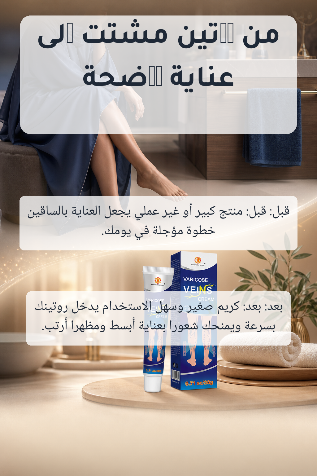
You are creating section 3 of 8 of a VERTICAL portrait landing-page banner for Varicose Veins Cream. Subject (must appear, photoreal, visually integrated into the scene): - Varicose Veins Cream (skincare / varicose veins cream) - The product packaging in reference image #1 is the EXACT subject — keep its label, colors, shape, and proportions faithful. Visual identity: - Palette: #253A87, #0A6F9A, #F6F4F0, #D6A58A, #7A5A3A, #E6B31D. - Mood: clinical, medical, clean, blue packaging, modern, informative, product mockup, surgical, minimal, commercial. - Editorial GCC (Khaleeji) aesthetic. Warm, premium, modern. - NO embedded text, NO logos other than the product's own, NO watermarks. - NO flat solid-color backgrounds — always rich texture, depth, gradients. Composition: 1024×1536 portrait, 2:3 ratio. A tasteful before/after mood, never medical. SEAMLESS TOP EDGE (critical): Reference image #2 is the BOTTOM strip of the PREVIOUS section. The TOP edge of THIS image MUST visually continue from that strip: same dominant colors at the top, matching texture and lighting, so when stacked the seam is invisible. Treat reference #2 as the literal pixels that sit above the top of your canvas. SEAMLESS BOTTOM EDGE: Leave the BOTTOM ~20% of the image as a calm gradient or texture (no prominent subject, no text region), so the next section's top edge can blend in cleanly. Save the bottom 256 px for the seam — keep it visually quiet. SECTION 3 — BEFORE / AFTER ========================== Role: A tasteful, non-medical visual comparison. Scene: - Top half: a "before" mood representing "قبل: منتج كبير أو غير عملي يجعل العناية بالساقين خطوة مؤجلة في يومك.". Cooler / muted color treatment, no negative imagery, suggested through color and texture only. - Bottom half: an "after" mood representing "بعد: كريم صغير وسهل الاستخدام يدخل روتينك بسرعة ويمنحك شعورًا بعناية أبسط ومظهرًا أرتب.". Warmer, brighter, with the product (ref #1) clearly visible as the transformative element. - Divider: a soft visual transition (gradient band, particles, or curve) — NEVER a hard horizontal split line. - Reserve a calm zone near the middle for an overlay headline. Mood cue: - Before: قبل: منتج كبير أو غير عملي يجعل العناية بالساقين خطوة مؤجلة في يومك. - After: بعد: كريم صغير وسهل الاستخدام يدخل روتينك بسرعة ويمنحك شعورًا بعناية أبسط ومظهرًا أرتب.
إعادة توليد
4. testimonials
done
الإعدادات
تعديل الوصف (اختياري):
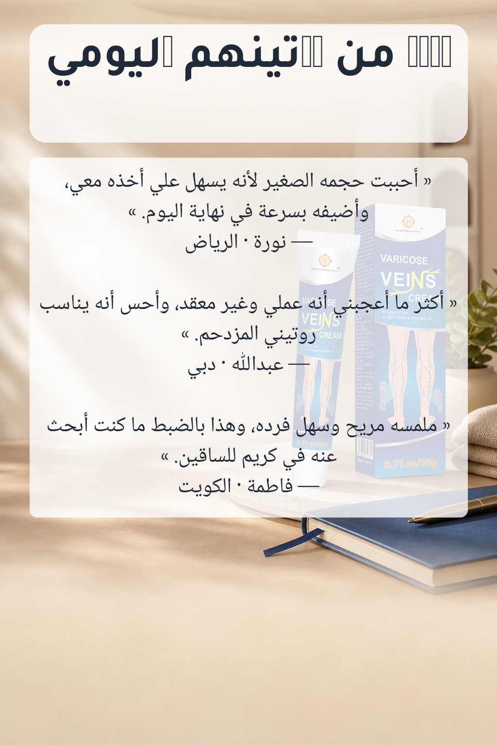
You are creating section 4 of 8 of a VERTICAL portrait landing-page banner for Varicose Veins Cream. Subject (must appear, photoreal, visually integrated into the scene): - Varicose Veins Cream (skincare / varicose veins cream) - The product packaging in reference image #1 is the EXACT subject — keep its label, colors, shape, and proportions faithful. Visual identity: - Palette: #253A87, #0A6F9A, #F6F4F0, #D6A58A, #7A5A3A, #E6B31D. - Mood: clinical, medical, clean, blue packaging, modern, informative, product mockup, surgical, minimal, commercial. - Editorial GCC (Khaleeji) aesthetic. Warm, premium, modern. - NO embedded text, NO logos other than the product's own, NO watermarks. - NO flat solid-color backgrounds — always rich texture, depth, gradients. Composition: 1024×1536 portrait, 2:3 ratio. Lifestyle ambience that suggests real customers love it. SEAMLESS TOP EDGE (critical): Reference image #2 is the BOTTOM strip of the PREVIOUS section. The TOP edge of THIS image MUST visually continue from that strip: same dominant colors at the top, matching texture and lighting, so when stacked the seam is invisible. Treat reference #2 as the literal pixels that sit above the top of your canvas. SEAMLESS BOTTOM EDGE: Leave the BOTTOM ~20% of the image as a calm gradient or texture (no prominent subject, no text region), so the next section's top edge can blend in cleanly. Save the bottom 256 px for the seam — keep it visually quiet. SECTION 4 — TESTIMONIALS ======================== Role: Social-proof feel without showing fake quote cards. Scene: - Background: ambient lifestyle scene (light café table, warm interior, soft sunlight) that gives a feeling of real customers loving the product. - The product (ref #1) tastefully placed off-center (right or left third), accompanied by everyday objects — a journal, a small plant, a folded soft fabric. - Reserve 3 calm horizontal zones stacked vertically for testimonial cards to be overlaid on top later. Testimonials to leave room for (3 cards): - نورة — الرياض: "أحببت حجمه الصغير لأنه يسهل عليّ أخذه معي، وأضيفه بسرعة في نهاية اليوم." - عبدالله — دبي: "أكثر ما أعجبني أنه عملي وغير معقد، وأحس أنه يناسب روتيني المزدحم." - فاطمة — الكويت: "ملمسه مريح وسهل فرده، وهذا بالضبط ما كنت أبحث عنه في كريم للساقين."
إعادة توليد
5. faq
done
الإعدادات
تعديل الوصف (اختياري):
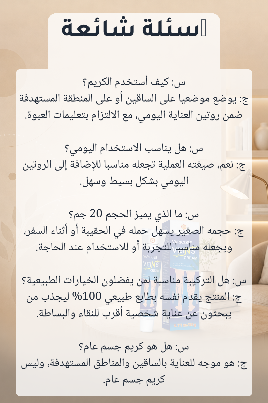
You are creating section 5 of 8 of a VERTICAL portrait landing-page banner for Varicose Veins Cream. Subject (must appear, photoreal, visually integrated into the scene): - Varicose Veins Cream (skincare / varicose veins cream) - The product packaging in reference image #1 is the EXACT subject — keep its label, colors, shape, and proportions faithful. Visual identity: - Palette: #253A87, #0A6F9A, #F6F4F0, #D6A58A, #7A5A3A, #E6B31D. - Mood: clinical, medical, clean, blue packaging, modern, informative, product mockup, surgical, minimal, commercial. - Editorial GCC (Khaleeji) aesthetic. Warm, premium, modern. - NO embedded text, NO logos other than the product's own, NO watermarks. - NO flat solid-color backgrounds — always rich texture, depth, gradients. Composition: 1024×1536 portrait, 2:3 ratio. Calm reading-room panel with space for Q&A overlays. SEAMLESS TOP EDGE (critical): Reference image #2 is the BOTTOM strip of the PREVIOUS section. The TOP edge of THIS image MUST visually continue from that strip: same dominant colors at the top, matching texture and lighting, so when stacked the seam is invisible. Treat reference #2 as the literal pixels that sit above the top of your canvas. SEAMLESS BOTTOM EDGE: Leave the BOTTOM ~20% of the image as a calm gradient or texture (no prominent subject, no text region), so the next section's top edge can blend in cleanly. Save the bottom 256 px for the seam — keep it visually quiet. SECTION 5 — FAQ =============== Role: An informative, calm panel that visually reads as "answers". Scene: - A reading-room mood: soft beige / warm gradient background. - The product (ref #1) in the lower-third, small but recognizable. - Upper two-thirds: an open, uncluttered area with subtle illustrative motifs (soft circles, dotted lines, gentle paper texture) that suggest "questions answered" without rendering literal Q&A boxes. - Reserve 5 stacked horizontal strips for FAQ text to be overlaid on top later. FAQ list (overlay zone reference only — DO NOT draw text): - س: كيف أستخدم الكريم؟ — ج: يوضع موضعيًا على الساقين أو على المنطقة المستهدفة ضمن روتين العناية اليومي، مع الالتزام بتعليمات العبوة. - س: هل يناسب الاستخدام اليومي؟ — ج: نعم، صيغته العملية تجعله مناسبًا للإضافة إلى الروتين اليومي بشكل بسيط وسهل. - س: ما الذي يميز الحجم 20 جم؟ — ج: حجمه الصغير يسهل حمله في الحقيبة أو أثناء السفر، ويجعله مناسبًا للتجربة أو للاستخدام عند الحاجة. - س: هل التركيبة مناسبة لمن يفضلون الخيارات الطبيعية؟ — ج: المنتج يقدّم نفسه بطابع طبيعي 100% ليجذب من يبحثون عن عناية شخصية أقرب للنقاء والبساطة. - س: هل هو كريم جسم عام؟ — ج: هو موجّه للعناية بالساقين والمناطق المستهدفة، وليس كريم جسم عام.
إعادة توليد
6. lifestyle
done
الإعدادات
تعديل الوصف (اختياري):
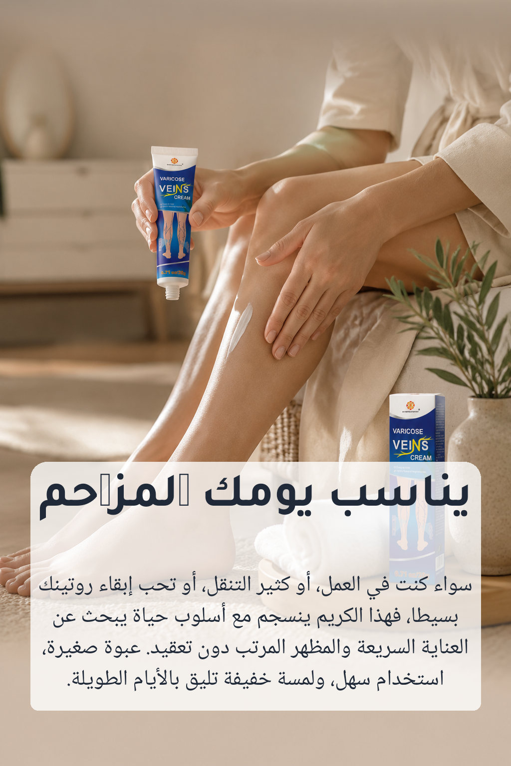
You are creating section 6 of 8 of a VERTICAL portrait landing-page banner for Varicose Veins Cream. Subject (must appear, photoreal, visually integrated into the scene): - Varicose Veins Cream (skincare / varicose veins cream) - The product packaging in reference image #1 is the EXACT subject — keep its label, colors, shape, and proportions faithful. Visual identity: - Palette: #253A87, #0A6F9A, #F6F4F0, #D6A58A, #7A5A3A, #E6B31D. - Mood: clinical, medical, clean, blue packaging, modern, informative, product mockup, surgical, minimal, commercial. - Editorial GCC (Khaleeji) aesthetic. Warm, premium, modern. - NO embedded text, NO logos other than the product's own, NO watermarks. - NO flat solid-color backgrounds — always rich texture, depth, gradients. Composition: 1024×1536 portrait, 2:3 ratio. The target user enjoying the product in daily life. SEAMLESS TOP EDGE (critical): Reference image #2 is the BOTTOM strip of the PREVIOUS section. The TOP edge of THIS image MUST visually continue from that strip: same dominant colors at the top, matching texture and lighting, so when stacked the seam is invisible. Treat reference #2 as the literal pixels that sit above the top of your canvas. SEAMLESS BOTTOM EDGE: Leave the BOTTOM ~20% of the image as a calm gradient or texture (no prominent subject, no text region), so the next section's top edge can blend in cleanly. Save the bottom 256 px for the seam — keep it visually quiet. SECTION 6 — LIFESTYLE ===================== Role: Place the product in the daily life of the target user. Target user: Adults looking for a simple, natural-feeling topical cream to add to their daily leg-care routine and prefer a compact, easy-to-use product. Primary use: Applied to the legs or other targeted areas as part of a daily self-care routine for a more cared-for, comfortable-looking finish. Scene: - A natural, candid lifestyle moment of the target user enjoying / using the product. Hands or partial body shots are preferred over identifiable faces, to keep it inclusive of a GCC audience. - The product (ref #1) is held, used, or sits next to the user as the clear focal object. - Setting: home, vanity, bathroom, kitchen, or wherever the primary use naturally happens — premium, real, lived-in. - Soft natural light, shallow depth of field. - Reserve a calm area near the bottom for an overlay headline + body. Mood cue: يناسب يومك المزدحم — سواء كنت في العمل، أو كثير التنقل، أو تحب إبقاء روتينك بسيطًا، فهذا الكريم ينسجم مع أسلوب حياة يبحث عن العناية السريعة والمظهر المرتب دون تعقيد. عبوة صغيرة، استخدام سهل، ولمسة خفيفة تليق بالأيام الطويلة.
إعادة توليد
7. education
done
الإعدادات
تعديل الوصف (اختياري):
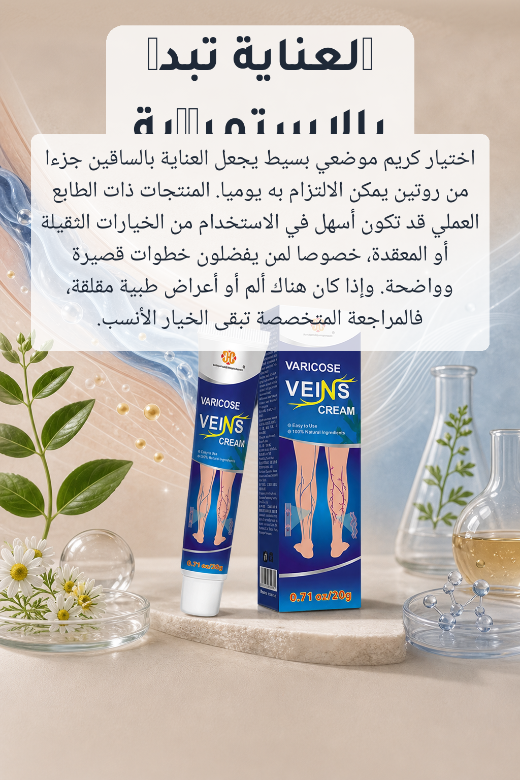
You are creating section 7 of 8 of a VERTICAL portrait landing-page banner for Varicose Veins Cream. Subject (must appear, photoreal, visually integrated into the scene): - Varicose Veins Cream (skincare / varicose veins cream) - The product packaging in reference image #1 is the EXACT subject — keep its label, colors, shape, and proportions faithful. Visual identity: - Palette: #253A87, #0A6F9A, #F6F4F0, #D6A58A, #7A5A3A, #E6B31D. - Mood: clinical, medical, clean, blue packaging, modern, informative, product mockup, surgical, minimal, commercial. - Editorial GCC (Khaleeji) aesthetic. Warm, premium, modern. - NO embedded text, NO logos other than the product's own, NO watermarks. - NO flat solid-color backgrounds — always rich texture, depth, gradients. Composition: 1024×1536 portrait, 2:3 ratio. Visual explainer — how / why the product works. SEAMLESS TOP EDGE (critical): Reference image #2 is the BOTTOM strip of the PREVIOUS section. The TOP edge of THIS image MUST visually continue from that strip: same dominant colors at the top, matching texture and lighting, so when stacked the seam is invisible. Treat reference #2 as the literal pixels that sit above the top of your canvas. SEAMLESS BOTTOM EDGE: Leave the BOTTOM ~20% of the image as a calm gradient or texture (no prominent subject, no text region), so the next section's top edge can blend in cleanly. Save the bottom 256 px for the seam — keep it visually quiet. SECTION 7 — EDUCATION ===================== Role: Explain how / why it works — infographic-feeling but visually rich. Scene: - The product (ref #1) prominent in the lower portion, slightly tilted or floating with a soft shadow. - Surround it with elegant illustrative motifs: cross-section views, droplets, leaves, ingredient hints — anything visual that suggests science meets nature, appropriate to "skincare". - Calm palette, plenty of negative space. - Reserve a strong upper-third zone for an overlay headline + body. Mood cue: العناية تبدأ بالاستمرارية — اختيار كريم موضعي بسيط يجعل العناية بالساقين جزءًا من روتين يمكن الالتزام به يوميًا. المنتجات ذات الطابع العملي قد تكون أسهل في الاستخدام من الخيارات الثقيلة أو المعقدة، خصوصًا لمن يفضلون خطوات قصيرة وواضحة. وإذا كان هناك ألم أو أعراض طبية مقلقة، فالمراجعة المتخصصة تبقى الخيار الأنسب.
إعادة توليد
8. closing
done
الإعدادات
تعديل الوصف (اختياري):
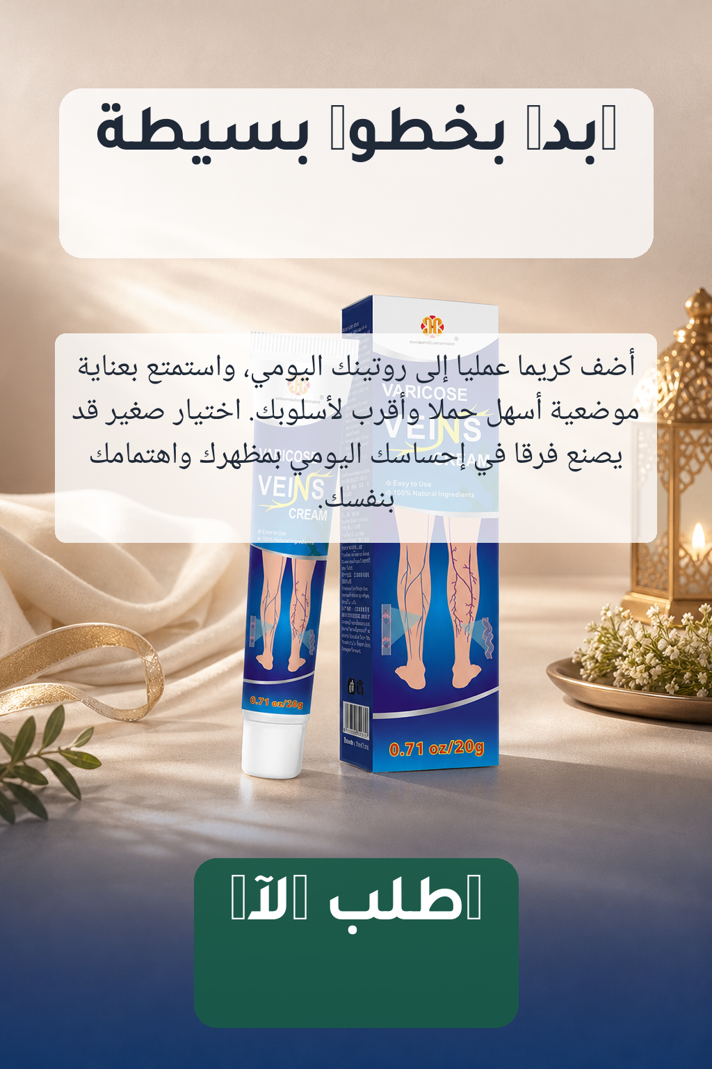
You are creating section 8 of 8 of a VERTICAL portrait landing-page banner for Varicose Veins Cream. Subject (must appear, photoreal, visually integrated into the scene): - Varicose Veins Cream (skincare / varicose veins cream) - The product packaging in reference image #1 is the EXACT subject — keep its label, colors, shape, and proportions faithful. Visual identity: - Palette: #253A87, #0A6F9A, #F6F4F0, #D6A58A, #7A5A3A, #E6B31D. - Mood: clinical, medical, clean, blue packaging, modern, informative, product mockup, surgical, minimal, commercial. - Editorial GCC (Khaleeji) aesthetic. Warm, premium, modern. - NO embedded text, NO logos other than the product's own, NO watermarks. - NO flat solid-color backgrounds — always rich texture, depth, gradients. Composition: 1024×1536 portrait, 2:3 ratio. Final, confident, gift-worthy hero shot for the CTA. SEAMLESS TOP EDGE (critical): Reference image #2 is the BOTTOM strip of the PREVIOUS section. The TOP edge of THIS image MUST visually continue from that strip: same dominant colors at the top, matching texture and lighting, so when stacked the seam is invisible. Treat reference #2 as the literal pixels that sit above the top of your canvas. SEAMLESS BOTTOM EDGE: Leave the BOTTOM ~20% of the image as a calm gradient or texture (no prominent subject, no text region), so the next section's top edge can blend in cleanly. Save the bottom 256 px for the seam — keep it visually quiet. SECTION 8 — CLOSING / CTA ========================= Role: A confident closing visual that drives the final purchase. Scene: - The product (ref #1) center-frame again, slightly different angle from the hero — gift-worthy, premium, almost ceremonial. - Subtle radiant background — soft beams of warm light, gradient glow behind the product. - Lower third: a calm dark or saturated band ready to host the final CTA overlay. - Optional supporting props: a soft fabric, a folded ribbon, small botanical sprigs — sparse, premium. Copy overlay zones (DO NOT draw text — leave the regions clear): - Upper third: headline "ابدأ بخطوة بسيطة" - Middle: body "أضف كريمًا عمليًا إلى روتينك اليومي، واستمتع بعناية موضعية أسهل حملًا وأقرب لأسلوبك. اختيار صغير قد يصنع فرقًا في إحساسك اليومي بمظهرك واهتمامك بنفسك." - Lower band: CTA "اطلب الآن"
إعادة توليد